.svg)
”Through a focused discovery process and a structured design approach, we built them an identity that speaks to the decision while honoring the story and values of the company.”
increase in investor pitch engagement
faster brand approval from stakeholders
brand consistency across all touchpoints
from brief to investor-ready brand identity





1. Conveying Trust and Authority in a High-Stakes Sector
Ziefah Health's primary buyers are state and local government agencies, public safety departments, and behavioral health organizations. The brand needed to communicate institutional credibility — the kind of trustworthiness associated with established firms like Deloitte — while still reflecting the company's deeply human values: compassion, warmth, and empathy.
2. Balancing Corporate Professionalism with Emotional Warmth
Most healthcare logos lean either clinical and cold, or soft and illustrative. Ziefah needed something in between — a clean, minimalist mark that felt at home on a government pitch deck and on a mobile app icon, without losing the humanity at the core of the mission.
3. Designing for Long-Term Scalability
The client was explicit: this identity had to last 20 years. Starting in Washington D.C., Baltimore, and Philadelphia, with ambitions to scale nationally and eventually internationally, the logo and guidelines needed to hold up across every context — app icons, letterheads, grant applications, presentations, and future marketing materials.
4. Completing a Full Rebrand After a Strategic Pivot
Ziefah had previously operated in a different direction. With a full pivot to crisis intervention tech, everything needed to be rebuilt from scratch — not refreshed. The new identity had to reflect who the company had become, not where it started.
1. Logo Design — Corporate Mark with a Human Core
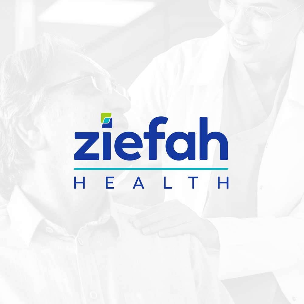
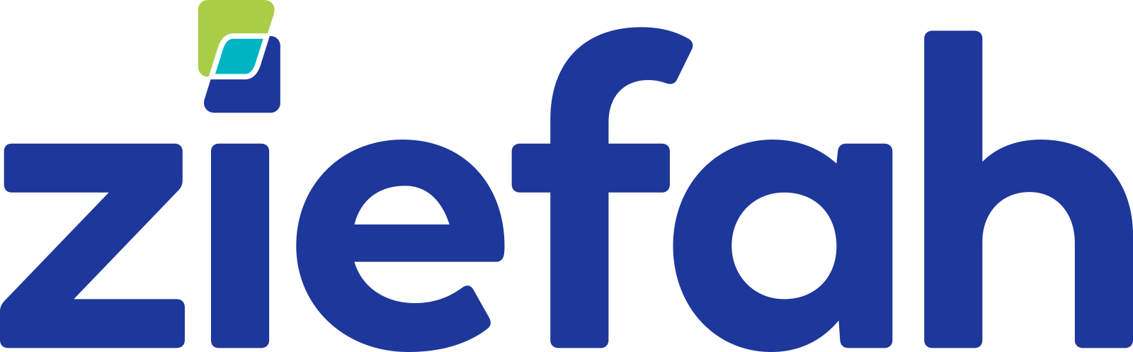
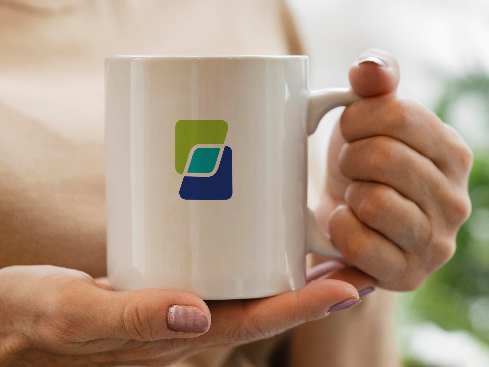
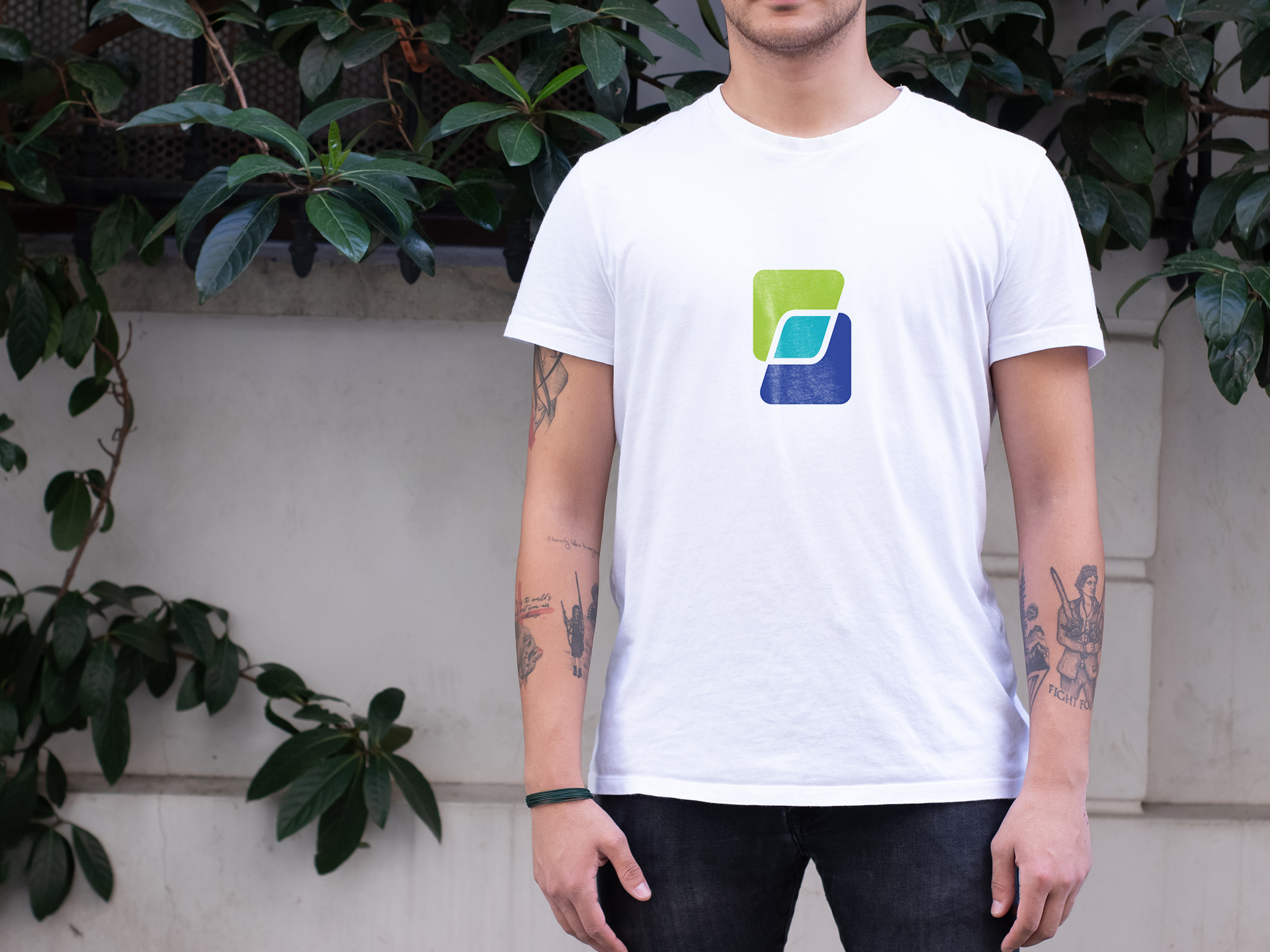
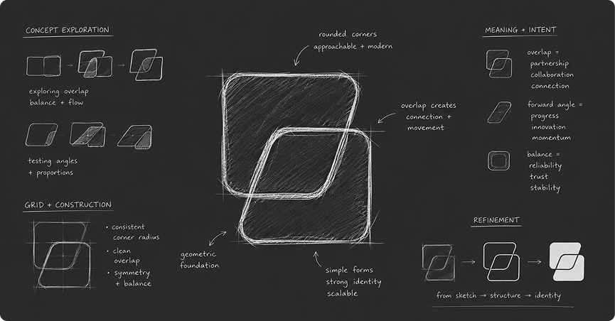
We developed three distinct logo directions, each exploring a different interpretation of Ziefah's brand values. The selected direction features a square intersection mark — a visual Venn diagram representing the two services Ziefah brings together: emergency dispatch and clinical mental health response. The design is sharp, geometric, and corporate in feel, with a prominent "Z" letterform that adds distinctiveness and recall.
2. Color System — Blue and Green for Health, Clarity, and Positivity
After reviewing the client's references — including Sanofi and Deloitte — and their own AI-generated palette explorations, we defined a refined color system built around blue and green tones. Blue conveys trust, stability, and authority. Green introduces health, freshness, and forward momentum. Together they signal a platform that is both serious and human.
3. Multiple Logo Variations for Every Context
Understanding that the mark would appear across a wide range of touchpoints — app icons, business cards, presentations, grant proposals, stationery, and signage — we delivered primary, secondary, stacked, and horizontal logo formats, with both outlined and unoutlined versions of the Z mark, ensuring visual consistency regardless of size or background.
4. Brand Guidelines Package
To set the foundation for everything that follows — website, app redesign, pitch decks, and marketing materials — we created a concise brand guidelines document covering color palette, typography rules, clear space and minimum size specifications, and usage examples for digital and print. The guidelines give Ziefah's internal team and contractors a single source of truth for all future brand applications.
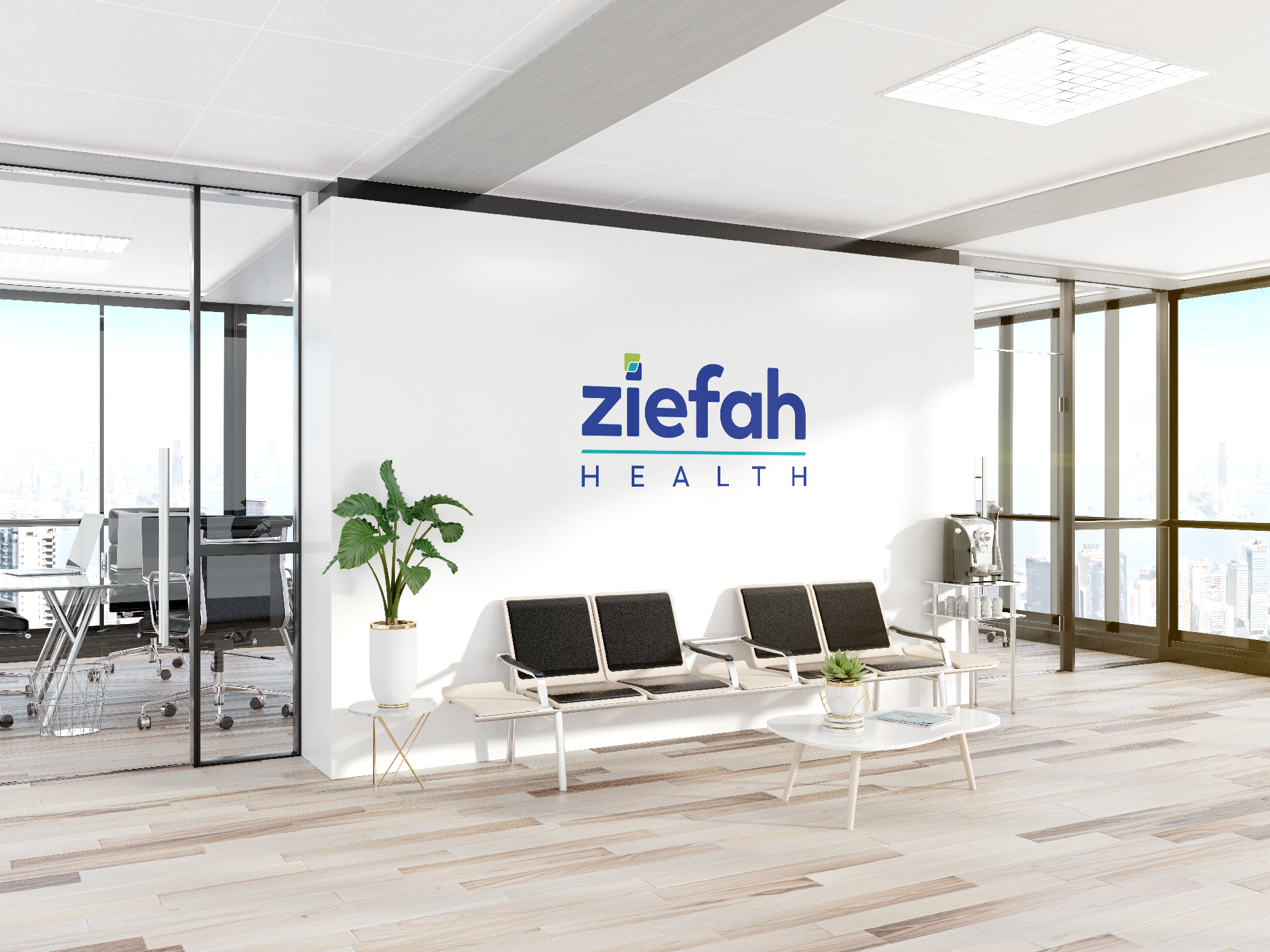
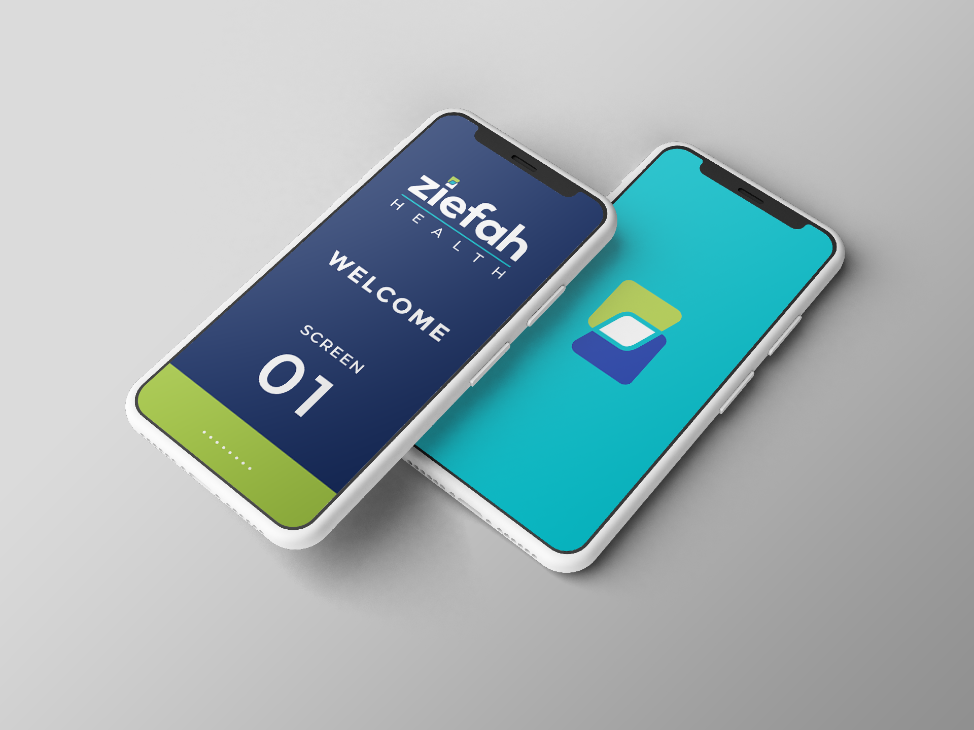
5. Application MockupsWe produced mockups showing the logo in real-world contexts — screens, business cards, bags, and pens — giving the client a concrete vision of how the identity translates from concept to professional presence ahead of their first major stakeholder presentation.
Investor and Stakeholder-Ready Identity
The new logo and brand package were delivered ahead of Ziefah's grant application deadline, giving the founder a polished, credible presence for her first round of funding and government partnership pitches.
Scalable Foundation for Future Growth
With a complete brand guidelines document in place, Ziefah's development team can now apply the new color palette directly to the existing platform prototype, and future vendors — for website, pitch decks, or marketing — have a clear visual system to work from.
A Brand That Reflects the Mission
The final identity positions Ziefah Health as what it is: a serious, purpose-driven technology company operating in a space where trust is everything. Clean enough for a government boardroom. Warm enough to reflect compassionate care.
Ziefah Health came to us mid-pivot, with a powerful mission and a brand that hadn't caught up yet. Through a focused discovery process and a structured design approach, we built them an identity that speaks to the decision-makers they need to reach — while honoring the story and the values that made the company worth building in the first place. The logo, color system, and brand guidelines now give Ziefah a scalable visual foundation ready to grow from Washington D.C. to every major city in the United States.